
Graphs
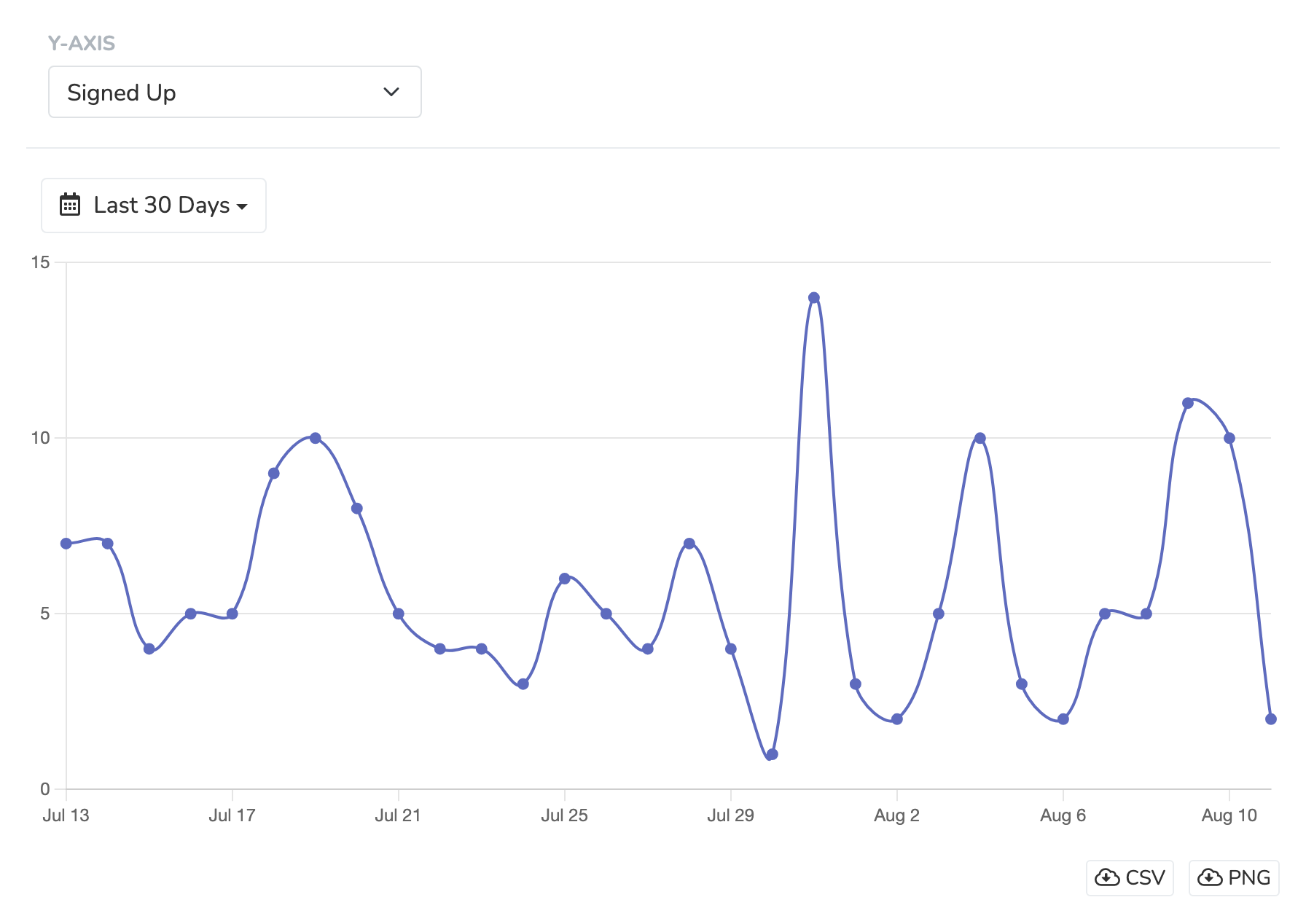
The Graphs section of the "Reporting" tab helps you visualize your data in graph form in a variety of useful ways. You can select from the list of pre-set Y-axes data metrics and set the date range for which you'd like to analyze the data. You'll immediately see a plotted graph, with a table view of the data underneath. Graphs are on the Standard, Professional, and Enterprise plans.
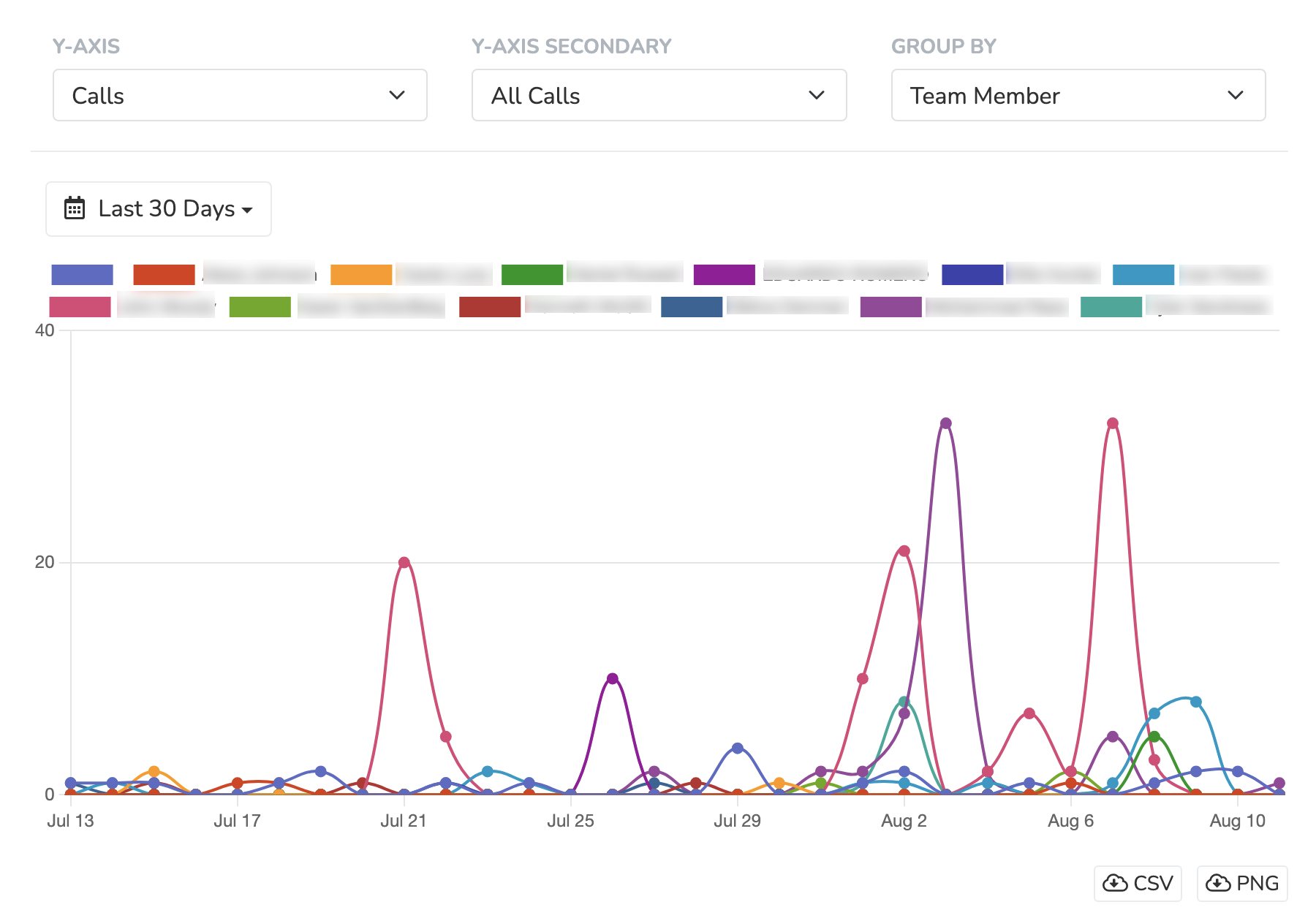
Certain y-axis fields let you choose a secondary y-axis and a "group by" field in order to add another dimension to your graph visualizations. For example, 'Calls' has a 'Y-Axis Secondary' select with 'Outgoing calls', 'Reached calls > 2 min', and 'Incoming calls'. 'Group By' can split the calls by 'Team Member'.
For any graph produced, you have the ability to fully export the data either in CSV format or as a PNG.
Updated 2 days ago